Energetic, colourful vision for a professional in East London
Tracy Byrne
Overview
Helping people from her East London base, Tracy Byrne is an energetic and passionate podiatrist that focuses on health and wellbeing of her patients. Together, we developed a vivid visual identity and a website design that captures her positive attitude.
Opportunity
Tracy is a multifaceted individual, working across podiatry, vitamin injections, and lifestyle. Most importantly, she’s a mother, which influences every aspect of her work. She focuses on building strong connections with her patients, thanks to her empathetic nature. It was vital to capture this strong ethos in an identity that is engaging, approachable, and adaptable to the various projects Tracy undertakes.
No items found.
Outcome
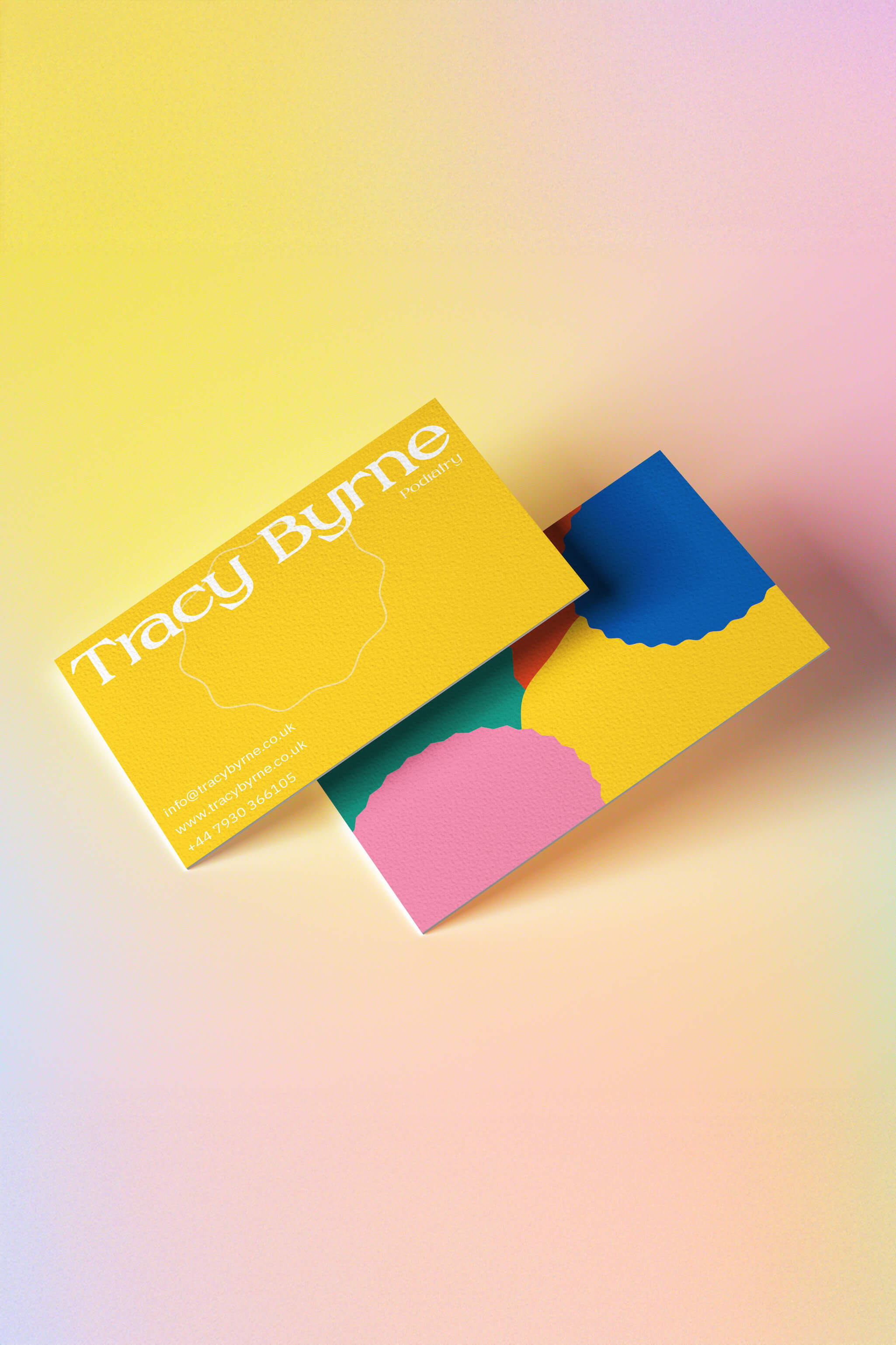
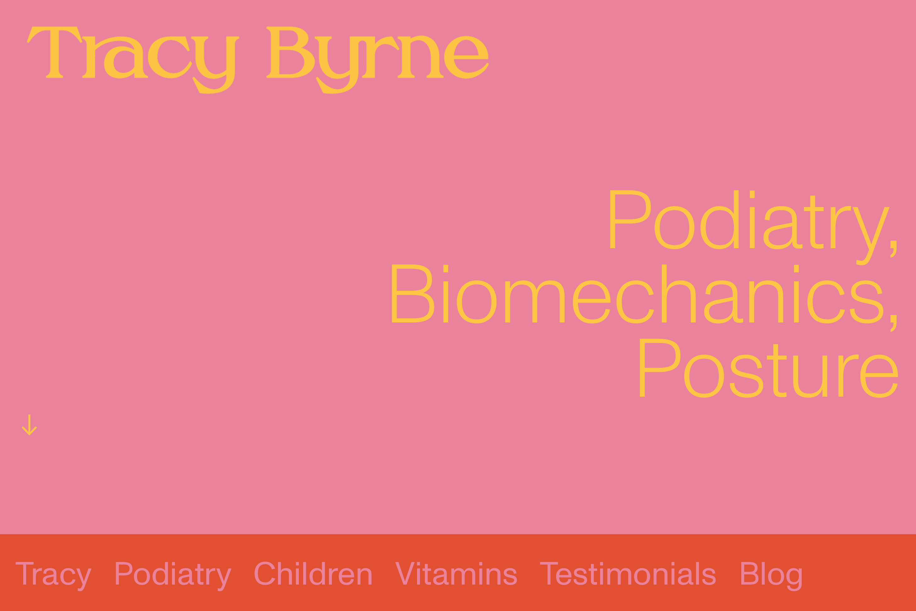
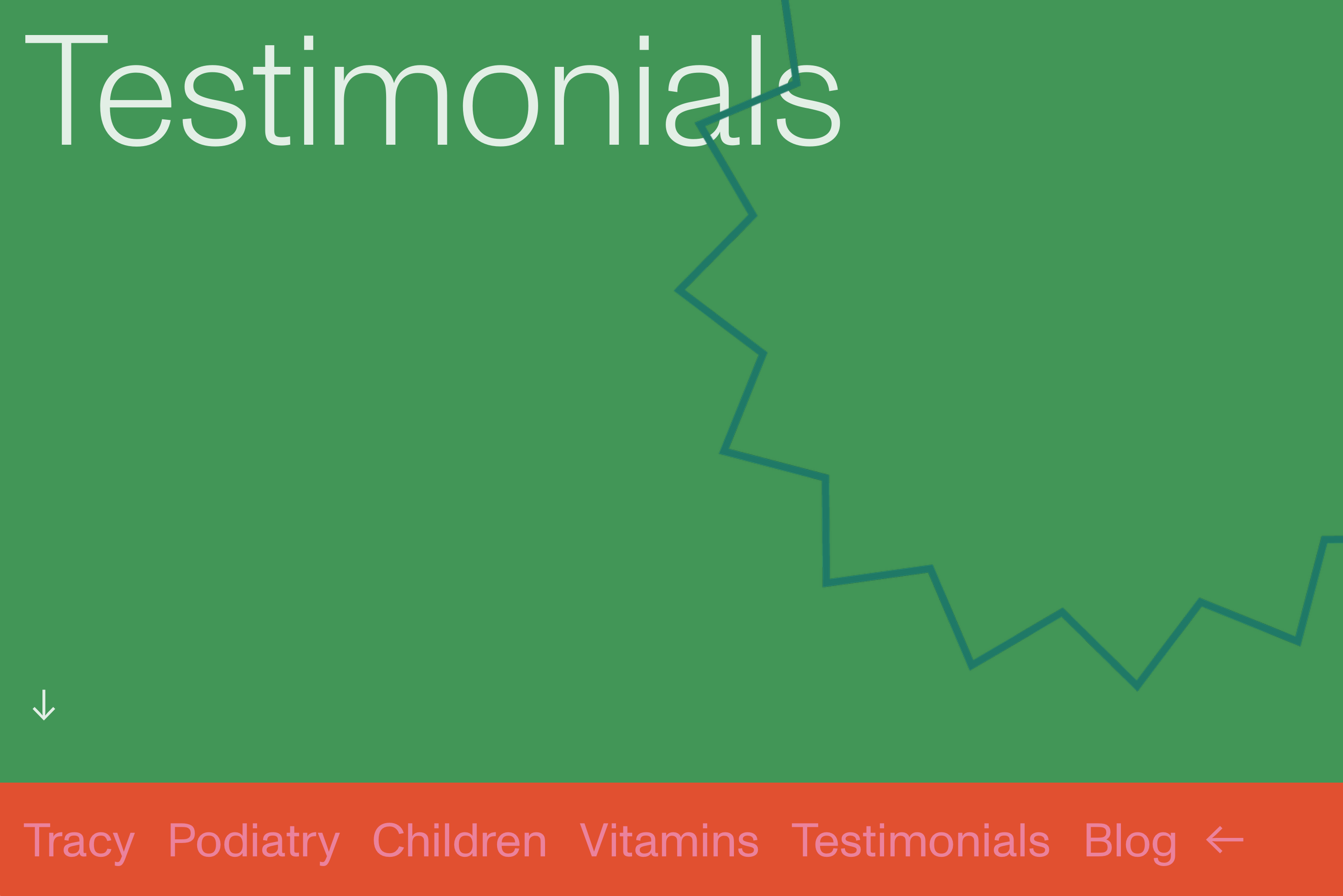
The main elements of the identity incorporate bold, colourful stickers that reference the diary in which Tracy organises her hectic life. The primary colours create an approachable palette that welcomes patients into a positive environment. The identity also reflects Tracy as an individual in other ways. The green colour is derived from the Irish flag, paying homage to her roots, and the chosen typeface for the logotype, Erga, resembles Tracy’s handwriting. These playful colours and shapes form the basis of the website, which serves as both a booking platform and an encyclopaedic information source on podiatry.